


Logos R Us
Author(s)
Renea Morris

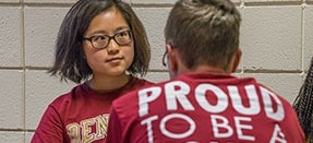
Revealing who/what we are.
Distinguishing us from others.
Inviting brand loyalty.
Our logo.
An important tool to help tell our brand story.
Last spring, we hit a milestone as an institution by marking the culmination of our analysis of DU’s perception and transitioning to a single logo. With an aim to differentiate ourselves and address the visibility and reputational challenges we face outside Denver and Colorado, uniting DU with a single logo builds on existing brand equity and enables us to create a consistent and scalable system. The University’s new interlocking DU helps us fulfill a variety of marketing needs, including digital as well as memorable and cohesive layering of brand expression for institution and unit sub brand marks.
At its best, our refreshed identity, accompanied by this new mark, is designed to differentiate us in the marketplace and enable us to demonstrate the real-world impact of the work we do to serve the public good. Sharing the logo was just the first step in revealing DU’s revamped brand, which was launched publicly on campus this fall. Over the last few months of the calendar year, MarComm team members did yeoman’s work to develop and distribute logo kits to units across campus. This was another history-making effort in which 270 logo kits including 10,260 individual logos were distributed to units across campus. Why was this such a herculean effort? Here are a few facts to help contextualize the project:
Each unit's logo set has a minimum of 38 versions of logos. The primary logo has more.
It takes a minimum of 15 minutes to create and save a single logo set. This doesn’t take into account the rest of the workflow and time needed to proof and package them, then place in the hands of the stakeholders (via email) or post on the brand website for easy, on-demand access.
- Each logo kit had to be uploaded to the Widen system separately and placed into their own collection.
- Metadata would then need to be added to these collections in order to accommodate web standards and make the logo files searchable within the Widen database.
- A share page for each logo kit then needed to be created in order to create a custom URL to host the kit files.
- These URLs were then embedded into a series of newly-created web pages on the new brand site to make them permanently and easily accessible.
The time it took to complete this portion of the process was approximately another 15 minutes per logo kit, along with significant additional time for the construction of the logo kit webpages on the brand site.
The logo collection for the largest academic unit on campus—the College of Arts, Humanities & Social Sciences—required the development of nearly 50 logo sets and 1,900 logo iterations!
Over the summer, a new (and inaugural) naming convention for unit titles, originally conceptualized by the Reputation Strategy Strategic Messaging Working Group in the spring, was presented and approved by executive leadership, resulting in a new level of consistency and necessitating additional dialogues in a few places.
To add to the complexity of the project, there was/is no single list of all units at the University. To determine which logos needed to be delivered, the team generated and quality-assured the lists for almost all in-house. While new units and gaps are still being discovered and resolved, we are now significantly closer to not just a clean suite of logos, but a list that can be shared as a resource for other units on campus and will expedite future projects. Our printing partner will incorporate this into an automated system for all campus partners to be able to request new business cards, letterhead, and envelopes, for added brand consistency across campus.
Simultaneously, while the standard kits were being prepared for campus partners, the team created a solution for legacy specialty marks that will be released in the first quarterly update to the style guides.
Lastly, and yes, at the same time, the team worked to create all of the new sports-specific logo kits for Athletics. As the University worked toward a single visual identity system for both academics and athletics, as an extension of the contemporary DU logo, there is a modernized arched Denver mark as well. Through the diligent work of many, the resulting images will work well over different mediums including uniforms, media outlets, fan apparel, and beyond. The traditional arched Denver will remain on the front of uniforms, serving as a bridge from the past to the future, as we compete for championships in our great 18 sport programs.
I’d like to give special shout-outs to the following MarComm team members:
Sr. Director for Marketing & Strategic Positioning Johanna Blickenstaff, Art Director René Moffatt, and Production Artist Todd Fisher.
Many thanks also to Adina Raizen, Ben Klibaner, Elizabeth Jergens, Heather Hein, Kelsey Bingham, Nicole Ford, Tamara Chapman, and Abigail Girard for making all of this happen before the winter break and for tackling the new requests that continue to come in.